General Guidelines
Our work must be accessible to users that could have any number of physical or mental disabilities. Practically this means we need to make sure that every functionality of our web apps can be accessed using only the keyboard and that navigating the site using a screenreader is as intuitive as is possible. Specifically, we conform to the Web Content Accessibility Guidelines, as defined here, and presented more concisely here.
Many of the specific guidelines on that list do not apply directly to the work we do in our apps, but it is helpful to be aware of them. This document will outline some of the specific practices and conventions that we employ to make sure that we are compliant.
Testing a page
The easiest way to test a page or a component for accessibility is to run a lighthouse audit from Chrome’s dev tools. Lighthouse now has it’s own tab.
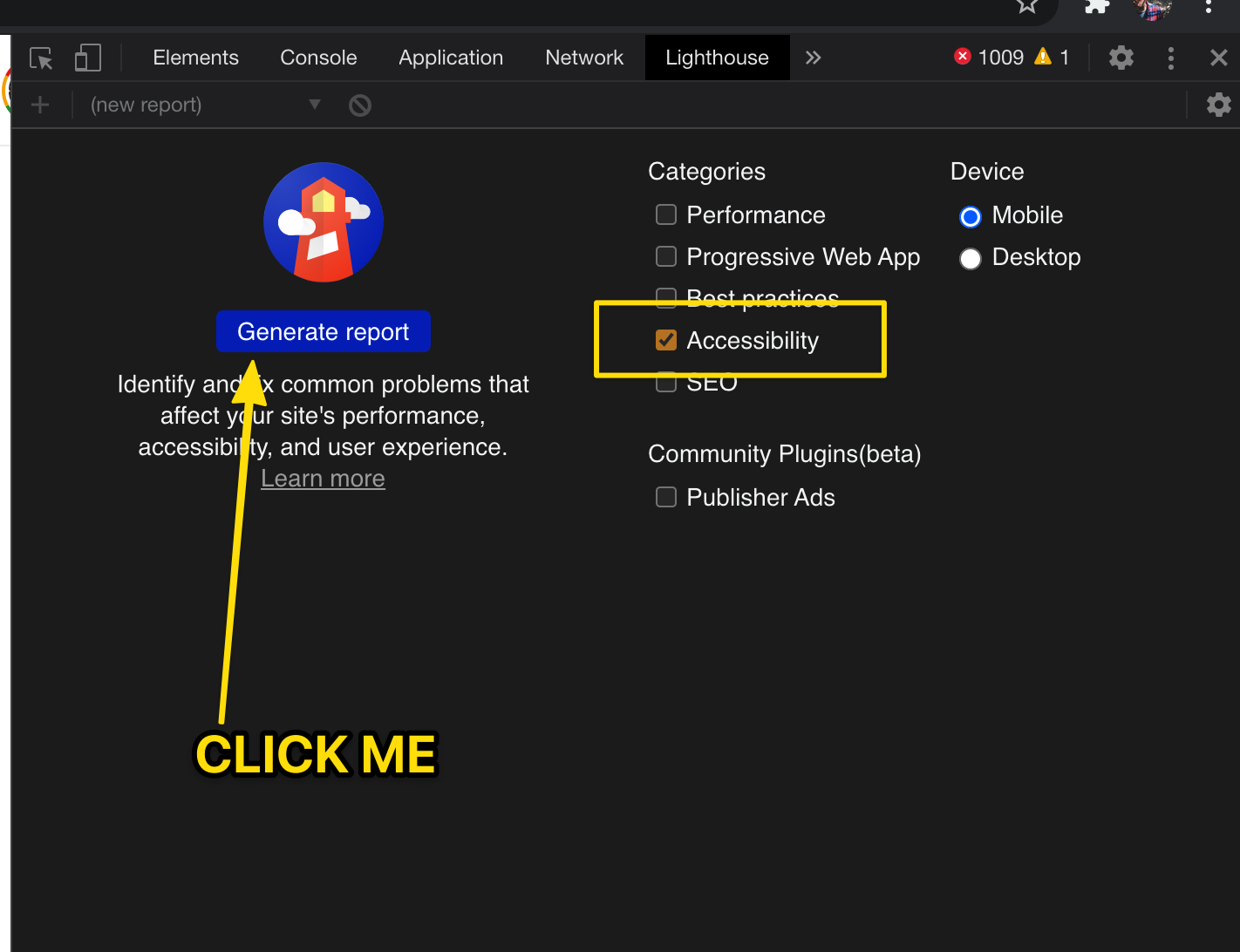
Running this tool will generate a list of issues and suggested fixes. Notably, the tool does not know how to click on things like dropdowns or pagination controls, so it will not test items that are hidden when the page is initially loaded… however it will give you a good idea of any potential issues.
Specific Issues
JUST USE A BUTTON.
As a rule, do not put on-clicks on anything besides a <button> or <jha-button>.
<button>s include a lot of accessibility features that can be obnoxious to recreate such as navigation with the tab key, simulating clicks with keypresses and automatic role/labels. if you’re making something that should be clicked on (and it’s not just a link), just use a <button> instead of a div. It is easy enough to restyle a button so that it doesn’t look like a button… the primary benefit of using the button tag is not the appearance but the functionality.
Icons need a label.
All instances of <jha-icon-*> need to have an aria-label attribute unless the immediate context has text that makes the icon’s meaning obvious. If an icon is used for presentation only or if completely removing it would not hurt the functionality of the site then it should be hidden from screenreaders with the aria-hidden="true" attribute. This is primarily important for icon buttons. For example, there are many instances of caret icons used as ‘back’ buttons that do not have any text associated with them:
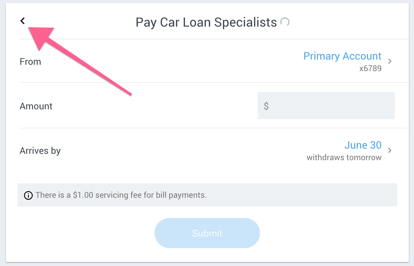
This type of thing can be quite confusing when landing on it with a screenreader… but if it has an aria-label then the screenreader will read one of those rather than just saying something ambiguous like “button” or “left-caret.png”.
In the past we have put aria-labels on the jha-button component itself instead of adding it to the icon. We are now preferring to specifically label the icon rather than the button. This makes the screenreader experience more uniform and resolves a couple of edge-case bugs.
We have also used the title attribute for this purpose, but have made an attempt to convert all of these to aria-labels because title is not universally supported.
Images need an alt.
The first and perhaps most important of the Web Accessibility Guidelines is that all images or visual media must have appropriate alternative texts. Even images that do not convey content, are decorative, or contain content that is already conveyed in text should be given null alt text (alt=""). We have very few actual images inside of Banno Online, but this applies to things like user uploaded check images, images that are attached inside of conversations and a user’s profile picture.
Inputs need a label or an aria-label
All inputs should have a label. Without a label a screenreader will just announce “Edit text” or something equally unhelpful. If the construction of the page makes it difficult to associate a label with the input, give it an aria-label.
This also applies to input components such as the jha-form-switch and the jha-form-checkbox.
Use headings
One of the primary ways that users of screenreaders navigate a webpage is by the various h-tags on the page. We should accomodate this by giving all of our cards and other main sections an h1 as a title so that users can jump from card to card easily.
Focus States and Keyboard Navigation
Absolutely every part of our product should be navigable using the keyboard. At it’s most basic level this takes the form of pressing the TAB key repeatedly to step through each clickable item on the page.
At all times the item that is being focused by the TAB key should be easily visible either because of the ‘focus indicator’ or because of some other specific indication that the item is being focused. Most jha-buttons and links will have the default focus ring. Floating-group inputs do not have a ring, but the input border changes color and the label floats making it obvious that it is focused. Some clickable items on our dashboard gain a gray background when they are focused.
At no time should the ‘focus’ be hidden or go off the screen. For example, If we have a dropdown with links in it, we should not be able to tab into that dropdown and select those links with it being closed.
Color Contrast
Color contrast is a very important element in the WCAG guidelines. As Devs we rely on variables that are set by our design team, so we don’t commonly have to worry about checking contrast. However, if you see something that seems like a failure it might be worth pointing it out to the design team. Most text in Banno Online needs to have a contrast ratio of 4.5:1 which can be checked with the Chrome Dev Tools by inspecting the element in question.