These guidelines define how we define and use custom properties or css variables to style components in all of our apps. In particular, shared jha components should follow a specific set of standards so that their appearance and usage are both flexible and predictable.
If a refresher is needed, MDN is a great resource. Note that we regularly make use of fallback values, which are explained on that page.
We must represent all color values used in our apps with variables. It is not acceptable to use any hardcoded hex or rgb colors in our apps because that breaks the ability to edit themes. Even white (#fff) needs to be represented by a variable now that we support dark mode.
JHA Components
Components such as jha-button and jha-form-floating-group are used commonly and consistently throughout all of our Polymer apps. As a general rule, it is appropriate for these components to use the shared jha color variables. Sticking to this small subset of variables, or using them as a fallback will ensure that any project that needs to use them only has to define a small set of variables to get their baseline functionality..
JHA Base Variables
--application-color: #7D57C1;

/* JHA Component Custom Variables */
--jha-color-primary: #3aaeda;
--jha-color-success: #4caf50;
--jha-color-danger: #f44336;
--jha-color-dark: var(--jha-text-dark);
--jha-color-warning: #fca902;
--jha-color-neutral: #8d99a0;
--jha-color-muted: var(--jha-text-muted);
--jha-color-light: #eef1f4;

--jha-text-light: #8c989f;
--jha-text-base: #6b757b;
--jha-text-dark: #455564;
--jha-text-white: #ffffff;
--jha-text-theme: var(--jha-color-primary);
--jha-text-neutral: #8d99a0;
--jha-text-muted: #b3bfc9;

--jha-background-color: #edeeef;
--jha-component-background-color: #ffffff;

--jha-focus-highlight-color: rgba(153,153,153,.12);

--jha-border-color: #e4e7ea;
--jha-border-color-hover: #d3d8dd;

--jha-text-size-base: 14px;
--jha-content-inset: 24px;
The above variable definitions are typical in Enterprise apps. These specific values are copied from the People index.html.
Constructing variables
When further customization is needed for a shared jha-component, component specific variables should be created, using these jha-colors as fallbacks like so:
color: var(--jha-button-text-color, var(--jha-color-light))
In this way, devs will be able to style the component as desired, but if no color definition is given, the component will still fallback to a default appearance. Fallbacks should always be included.
The pattern for defining component specific variables should be predictable. In general follow this type of pattern:
--componentName-modifier-element-cssProperty
The modifier and element are optional, but may be useful depending on the component in question. element refers to sub-elements inside of a component, such as a header or footer. modifier refers to things like disabled hover focused and/or variations in style such as small or no-padding. cssProperty should stick as close as possible to the actual css property that is being set (i.e. font-size, background-color, opacity). A possible exception is when the property name is a bit ambiguous such as with color in this case it is preferable to be slightly more specific and label it text-color
Here are some examples:
--jha-button-text-color
(--componentName-cssProperty)

--jha-button-hover-text-color
(--componentName-modifier-cssProperty)

--jha-card-no-padding-footer-font-size`
(--componentName-modifier-element-cssProperty)
Obviously these have the potential to become quite verbose. Using a predictable pattern makes using them significantly easier for everyone.
IMPORTANT NOTE
component-specific variables such as
jha-button-background-colorshould not be used to style other things. Even though the colors might match up it is better to use a generic variable such asjha-color-primarywhen styling other components. The exception here is components that are meant to look exactly like the component from which you are using a variable. Example: a div or a button that is meant to look just like a jha-list-item should use the jha-list-item variables.
Banno Online Components/Variables.
Banno Online is fully themeable. The set of colors that we have available and should use is defined and maintained by the design team. We should try, as best we can, to use the appropriate variables throughout Banno Online. In some cases, multiple colors may have a very similar appearance on our test-FIs, but the design team uses an extensive list of colors to be very flexible in designing themes for new FIs—in most cases, using the correct variable does matter. For instance, in many situations, --action-button-color and --body-text-theme-color are very similar. But there are some FIs where they are significantly and noticeably different, and using the wrong one will make text completely unreadable..
NOTE: In the past we have tried to use the above-mentioned jha-color variables in our Banno Online components so that re-using these components in Enterprise apps works as smoothly as possible. However this has caused some trouble in Banno Online because in several instances there is not an appropriate jha-color that matches what our Design team has intended for Banno-Online themeability.
Going forward we will be sticking with the Banno Online variables, and will define those in any enterprise app that wishes to use a BO component.
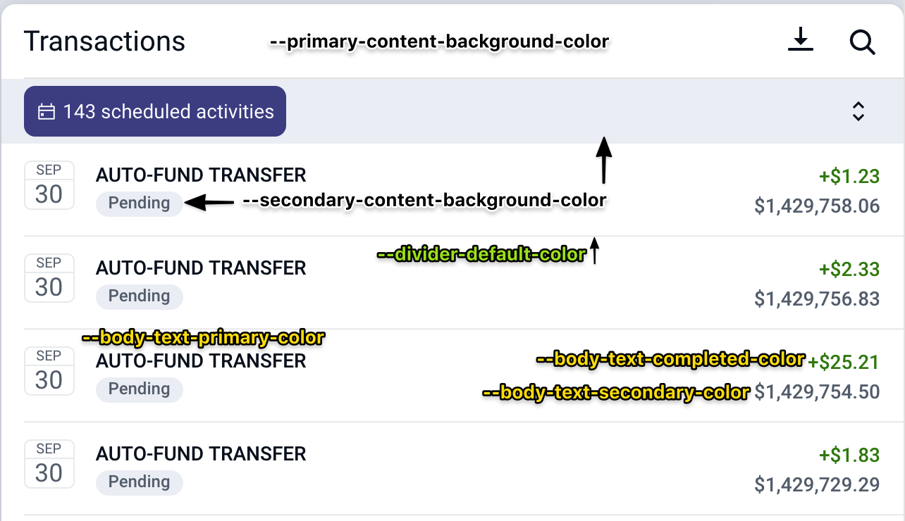
Common variable usage reference
Listed here are some examples of our most commonly used theme properties with screenshots showing their usage. This is not a comprehensive list, but should serve as a good reference and overview of the theme properties we use most often.
Dark Mode
Most FIs now have both a light and a dark theme. If we are diligent about using the appropriate variables in our apps then dark themes should just work without any additional effort.
Sharing Banno Online Components
When Banno Online components need to be shared with enterprise apps some custom variables will likely need to be created so that the components can be themed appropriately.
Ideally enterprise apps will have defined the above list of custom-variables with appropriate enough values that not much work needs to be done, but in the case that somethign does need altered, the component-specific-variable pattern listed above should be followed:
--bannoweb-activity-card-header-text-color: #c0ffee;
Complete variable list
The following is a list of all of our Available Color variables in Banno Online. This is the Silverlake light theme. Most of the colors are named appropriately and descriptively, but it can still be hard to know exactly what to use in a given instance. If there’s any question about which variables should be used the design team is usually happy to provide clarity.
--account-card-primary-accent-color:rgb(30, 106, 151);
--account-card-primary-background-color:rgb(255, 255, 255);
--account-card-primary-text-color:rgb(25, 25, 25);
--account-card-secondary-accent-color:rgb(255, 255, 255);
--account-card-secondary-background-color:rgb(72, 80, 89);
--account-card-secondary-text-color:rgb(255, 255, 255);
--action-card-accent-color:rgb(71, 76, 174);
--action-card-background-color:rgb(255, 255, 255);
--action-card-text-color:rgb(25, 25, 25);
--android-gesture-bar-color:rgb(255, 255, 255);
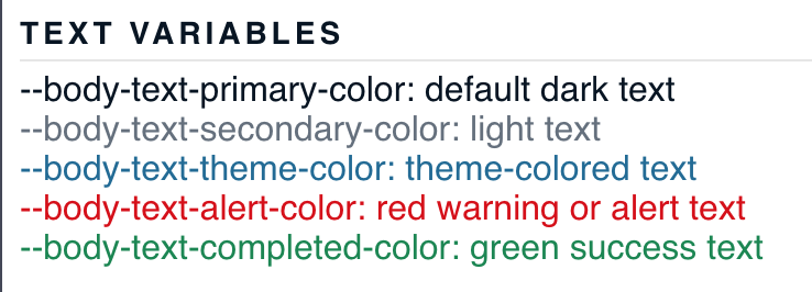
--body-text-alert-color:rgb(215, 9, 9);
--body-text-completed-color:rgb(18, 135, 81);
--body-text-deposit-color:rgb(18, 135, 81);
--body-text-highlight-color:rgb(18, 135, 81);
--body-text-primary-color:rgb(7, 21, 35);
--body-text-rejected-color:rgb(215, 9, 9);
--body-text-secondary-color:rgb(100, 112, 125);
--body-text-theme-color:rgb(30, 106, 151);
--button-corner-radius:8px;
--card-corner-radius:10px;
--card-shadow:0 3px 12px 0 rgba(0,0,0,0.15);
--card-title-text-color:rgb(7, 21, 35);
--dashboard-page-background-color:rgb(211, 229, 238);
--default-button-border-color:rgb(217, 217, 217);
--default-button-border-disabled-color:rgba(217, 217, 217, 0.3);
--default-button-border-focused-color:rgba(217, 217, 217, 0.5);
--default-button-border-pressed-color:rgba(217, 217, 217, 0.2);
--default-button-color:rgba(217, 217, 217, 0);
--default-button-disabled-color:rgba(217, 217, 217, 0.3);
--default-button-focused-color:rgba(217, 217, 217, 0.1);
--default-button-pressed-color:rgba(217, 217, 217, 0.2);
--default-button-text-color:rgb(30, 106, 151);
--default-button-text-disabled-color:rgba(30, 106, 151, 0.5);
--default-button-text-focused-color:rgb(30, 106, 151);
--default-button-text-pressed-color:rgb(30, 106, 151);
--divider-alternative-color:rgba(100, 112, 125, 0.6);
--divider-default-color:rgb(230, 230, 230);
--error-background-color:rgb(215, 9, 9);
--error-text-color:rgb(255, 255, 255);
--footer-background-color:rgb(255, 255, 255);
--footer-link-text-color:rgb(72, 80, 89);
--footer-text-color:rgb(100, 112, 125);
--hero-empty-card-color:rgba(0, 0, 0, 0.15);
--hero-gradient-colors:linear-gradient(rgba(214, 240, 255, 0.3), rgba(214, 240, 255, 0.6), rgb(211, 229, 238));
--hero-status-bar-mode:Dark;
--hero-text-color:rgb(7, 21, 35);
--indicator-background-color:rgb(215, 9, 9);
--indicator-text-color:rgb(255, 255, 255);
--inline-icon-background-color:rgba(255, 255, 255, 0);
--inline-icon-color:rgb(30, 106, 151);
--link-button-focused-color:rgba(30, 106, 151, 0.1);
--link-button-pressed-color:rgba(30, 106, 151, 0.2);
--link-button-text-color:rgb(30, 106, 151);
--link-button-text-disabled-color:rgba(30, 106, 151, 0.3);
--link-button-text-focused-color:rgb(30, 106, 151);
--link-button-text-pressed-color:rgb(30, 106, 151);
--menu-background-color:rgb(255, 255, 255);
--menu-divider-color:rgb(230, 230, 230);
--menu-icon-background-color:rgba(255, 255, 255, 0);
--menu-icon-background-disabled-color:rgba(255, 255, 255, 0);
--menu-icon-background-pressed-color:rgba(255, 255, 255, 0);
--menu-icon-background-selected-color:rgba(255, 255, 255, 0);
--menu-icon-color:rgb(71, 76, 174);
--menu-icon-disabled-color:rgba(71, 76, 174, 0.3);
--menu-icon-pressed-color:rgb(71, 76, 174);
--menu-icon-selected-color:rgb(55, 167, 232);
--menu-item-color:rgba(255, 255, 255, 0);
--menu-item-disabled-color:rgba(35, 124, 176, 0);
--menu-item-pressed-color:rgba(7, 21, 35, 0.08);
--menu-item-selected-accent-color:rgb(55, 167, 232);
--menu-item-selected-color:rgba(35, 124, 176, 0.08);
--menu-text-color:rgb(7, 21, 35);
--menu-text-disabled-color:rgba(7, 21, 35, 0.3);
--menu-text-pressed-color:rgb(7, 21, 35);
--menu-text-selected-color:rgb(7, 21, 35);
--navigation-bar-button-color:rgb(35, 124, 176);
--navigation-bar-color:rgb(255, 255, 255);
--navigation-bar-title-color:rgb(7, 21, 35);
--pin-dot-color:rgb(30, 106, 151);
--primary-button-color:rgb(35, 124, 176);
--primary-button-disabled-color:rgba(35, 124, 176, 0.3);
--primary-button-focused-color:rgb(48, 153, 214);
--primary-button-pressed-color:rgb(91, 174, 222);
--primary-button-text-color:rgb(255, 255, 255);
--primary-button-text-disabled-color:rgba(255, 255, 255, 0.5);
--primary-button-text-focused-color:rgb(255, 255, 255);
--primary-button-text-pressed-color:rgb(255, 255, 255);
--primary-content-background-color:rgb(255, 255, 255);
--primary-theme-background-color:rgb(231, 243, 249);
--primary-theme-text-color:rgb(24, 116, 170);
--secondary-content-background-color:rgb(238, 241, 245);
--secondary-content-background-hover-color:rgb(222, 228, 236);
--secondary-page-background-color:rgb(238, 240, 241);
--secondary-theme-background-color:rgb(217, 219, 242);
--secondary-theme-text-color:rgb(71, 76, 174);
--status-bar-action-mode-color:rgb(231, 243, 249);
--status-bar-action-mode:Dark;
--status-bar-color:rgb(255, 255, 255);
--status-bar-mode:Dark;
--status-bar-primary-background-mode:Dark;
--toast-background-color:rgb(62, 69, 77);
--toast-text-color:rgb(255, 255, 255);
--toggle-switch-active-color:rgb(18, 135, 81);
--toolbar-action-mode-button-color:rgb(24, 116, 170);
--toolbar-action-mode-color:rgb(231, 243, 249);
--toolbar-action-mode-title-color:rgb(24, 116, 170);
--toolbar-button-color:rgb(35, 124, 176);
--toolbar-color:rgb(255, 255, 255);
--toolbar-title-color:rgb(7, 21, 35);